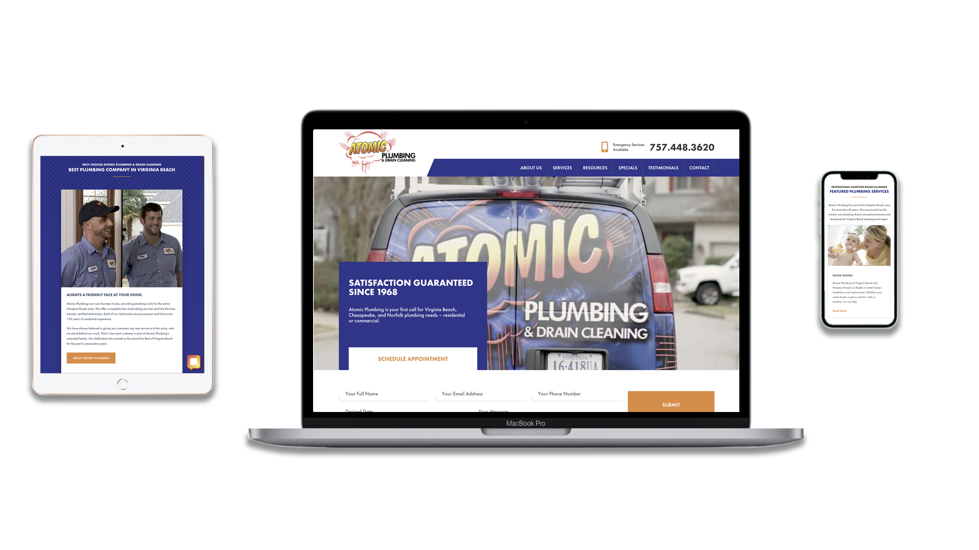
 Get this: According to CNN, the number of wireless devices in the U.S. now exceeds the number of people living here (source). Half of the American population owns a smartphone, and tablet-use increases steadily as the product becomes a more standard and less expensive market offering. These days, many people have even given up their laptops and desktops entirely for the ease and portability of tablets, and all signs point to that trend continuing. All of these facts imply a new age for businesses looking to keep a strong and professional online presence. Websites must be optimized for mobile viewing in order to be effective.
Is your website mobile-ready? By that, we mean, does it provide a pleasant, informative, functional, and easily navigable experience for people browsing on a variety of mobile devices and tablets? Trying to answer this question may seem a little daunting with the sheer number of different smartphones, tablets, and other mobile devices out there. How can you be sure that your site looks beautiful on each one? Well, unless you have unlimited access to the whole spread of available smartphones and tablets, you probably can’t.
You can, however, test your site on as many different devices as you can get your hands on and grab input from colleagues and friends about how they perceive your site on their mobile devices. Additionally, tools like Google’s Go Mo online app are incredibly useful for getting a general idea of a website’s mobile readiness and even provide suggestions of possible problem areas for mobile viewing. Some common, easily surmountable mobile issues include:
-Broken, too large, or inflexible images
-Lack of readability: Do you have to scroll from side to side in order to read the content
-Links that are difficult to click with one’s thumb
-Lack of search functionality or easily accessible contact information
-Mobile version of site is inconsistent with brand
When testing your site for mobile readiness, look for any evidence of these issues, take notes, and while you’re at it, start to consider what content on each page is essential (the main focus of the page), and what content might be nonessential in regards to the limited screen space of a mobile device. These notes will serve as a guide for the future as you readjust and pare down the website for mobile viewing.
From here, you have a few options. You can take the easy and reliable route and hire a good web designer to integrate a functional, aesthetically pleasing mobile version of the site into the current version, or you can do it yourself. The latter route is less costly but may take up more of your time. For the DIY crowd, Google’s Go Mo and Dudamobile offer simple desktop browser to mobile browser conversion.
No matter how you go about it, a seamlessly functional mobile website is one of the most vital components of your company’s online presence in an increasingly “on-the-go” culture. Meet your customers where they are (glued to their tablets and smartphones). If you need help optimizing your website for mobile, call the Primm Company today at 757-623-6234.


